Going mobile Part 2 – dealing with legacy content

This is part two in my “Going Mobile” series. As some you know I’m migrating my website to work on all smartphones and tablets. It’s been a really fun process, especially since at my day job I usually consult on how to do this. So, it’s been great to actually sink my teeth into my own full-blown project that also includes a content management system.

As I’ve mentioned before, I have almost 100 posts to manage through this transition along with a variety of plugins and hundreds of images. This site is not custom so upgrades and changes should be fairly routine.  What I mean is it’s a fairly run-of-the-mill WordPress installation so there isn’t anything really fancy or complicated about it. And, that’s the way I like it so it just runs itself without much maintenance or intervention.

So, I’m still in the preparatory phase of migrating over to mobile. There’s been a lot more things to deal with than the typical applications that I build. Here are some of the issues I’m working through now:  

Images not optimized for mobile. I have hundreds of images that I pasted into blog posts. Some of these are up to 400 pixels wide, which covers most of the screen for your average smartphone. Perhaps some good news is all of my images are PNG format, but they were intended for use on 1024×768 or greater monitor sizes. Now, if I change the size of these it could affect my default page formatting. I tried to avoid that type of problem in the very beginning in terms of how my images are placed on the page, but we’ll see. I’m still experimenting on what do, and in my estimation it all comes down to performance. If anyone has any recommendations let me know?

Web Server Permissions. My blog hosting provider is fairly strict on the server configurations and the mobile plug-in model requires server-side access. I basically traded some access for massively reliable uptime.  There have been some issues with the mobile plug-in and how it works with various pieces of WordPress, PHP and the web server itself. If you work for an organization with full admin access to your web server then this shouldn’t be much of an issue.

Blog post length. I have some long blog posts that require a bit of scrolling. I don’t know if there is a right or wrong answer on the appropriate length of a non-paginated blog post. Personally, I hate paginated websites and as a default I expect to get the full article. I read a few blogs already on my phone and while I don’t mind scrolling down I’ll have to see what kind of feedback I get from visitors and regular readers.

Cross-browser testing. With my current blog, I’ve never ever had to worry about cross-browser testing. WordPress just works, period. I’ve occasionally received browser-related complaints. However, after some investigation the majority of the complaints were spam emails try to trick you into clicking on a hostile link. Once I get everything up and running I’ve created a simple test sheet with various check-off items to make sure I’m (mostly) comfortable and can sleep at night knowing I didn’t just hose things up dramatically.

Plug-in compatibility with WordPress upgrades. This is a major concern. I like building my own software because I can adapt it to any underlying changes. With a plug-in you are at the mercy of the plug-in vendor and your content management system. My fallback plan for this is I can always disable the plug-in. For now while I’m in the experimenting phase, my blog foundation will remain fixed and designed for 1024×768 content. Ah yes good old 1024×768. So, if I do pull the plug on the plug-in (no pun intended) then in theory everything should revert back to my default theme until I can figure out a fix or move on to a more responsive design approach.

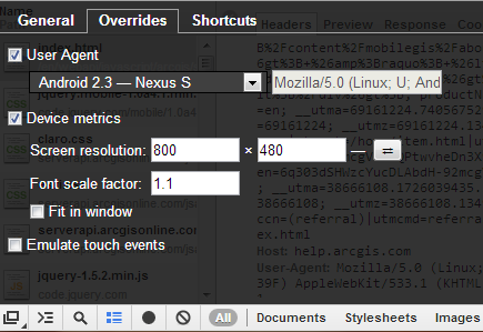
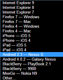
über easy user-agent swapping in Chrome

A little know setting in Chrome lets you easily spoof websites into thinking your desktop browser is an Android device or even an iPhone 4. This functionality has been around for about a year, but it seems very few web developers I’ve talked to actually know about it. It’s also not well documented in the Chrome developer docs, and it’s just mentioned in passing. So, this is me giving a shout-out to this very cool, useful and time saving functionality.

I love it because in seconds you can pseudo-emulate a mobile device view on the Chrome desktop browser. Sometimes I need to tweak something on a web mobile app and I don’t want to go through the hassle of viewing it on my device until I’m fully ready to test it on an external web server. With the user-agent tool you can set the size exactly for testing and viewing.

This is especially useful for when you are building responsive apps that use CSS3 media queries or frameworks like Twitter Bootstrap. In comparison, without this tool you have to manually resize the browser, which is time consuming, inaccurate and usually annoying.

Here’s how this works:

Step 1. In Chrome use Control + Shift + I to open the developer tools window. Then in the lower right hand corner click on the wheel icon.

Step 2. In the Overrides tab you can select User Agent or manually adjust the device screen resolution and font scale. Cool! There is even a checkbox option to emulate touch events using your mouse.  Note that there will still be mouse events, however you can also test code that listens for touch events.

Step 3. Use the User Agent pulldown list to choose from various presets.

Step 4. Easily swap between landscape and portrait modes.

Step 5. Make sure the correct user agent was sent via HTTP request header in the Network tab of the developer tools. You may need to reload the page.

Step 6. Have fun and try it out yourself!

Spam and Web ads are annoying but much better than TV ads

For now my blog will continue to be ad free. Full disclosure: I’ve had two offers in the last month to expose my visitors to ads. The presumption is that I would make some (albeit small) amount of money. However, I’ve done the homework and know that the advertisers make the big bucks and not the advertisees.

Ads in all forms continue to plague the earth because some surveys consistently show that they work. The math is stark and the math simple. Someone is responding to spam email, even the icky ones. Someone is clicking on those web ads, and someone claims to be watching TV ads and even going so far as saying they are effective. Gasp! I will reluctantly agree that some ads are useful for communicating new products or features, but that doesn’t mean I have to like them.

I recently read about a survey claiming that 53% of online consumers said a TV ad had influenced them to purchase a product or service in the last twelve months. My heart nearly stopped. Yikes! Who are these people? Speaking on behalf of my own brain, it automatically shuts down within 30 milliseconds of an ad starting on TV or Hulu, or YouTube. Sometimes I can barely read a news article because my brain automatically blurs out 3/4’s of the page where presumably the evil ads are lurking.

Here’s a fact. When you watch prime time television you will be brainwashed and turned into a zombie through the constant exposure of 50 – 70 ads per hour. I’ll repeat that in case you missed it: 50 to 70 advertisements in a single hour. I can tell you this with certainty because I sat down one night and decided to convert percentage of ad time per hour into a meaningful number that anyone could understand. If you watch two TV shows back-to-back that’s possibly 100 to 140 ads that have soaked into your sleep addled brain. And, these are the actual ads and the numbers don’t include embedded product placements that are getting increasingly brazen.

After I had a grasp on the level of digital bombardment we were receiving from TV ads, I was able to take some of the full page, online, take-temporary-control-of-the-entire-browser ads with a bit more perspective. I also said a silent praise for DISH Network’s Hopper.

Maybe I’m writing this blog post because an ad told me too.