4 things operating systems should do today…but don’t

This is my 2014 wish list for where operating systems (OS) should be headed with laptops, tablets, smartphones and smart devices. Now before you lambast me or fill my ears with technical mumbo-jumbo about why some of these ideas aren’t possible, just take a slow, deep breath. I offer these concepts up as a challenge to take things to the next level, and not as fodder for a debate contest of what’s possible and what’s not. I hope these ideas are viewed as worthy goals rather than existing only in our imaginations thru science fiction.

I suggest it’s time we rethink operating system kernel theory and discard some of our historical notions of how operating systems are supposed to work. I’m continually amazed that even the newest operating systems, such as Android, have fundamental problems similar to what we’ve had since the earliest versions of Windows! So here’s my list…

No more OS lockups – It’s 2014 and computers still experience software related operating system crashes. In the last year, I’ve personally had brand new Windows machines, Mac’s and smartphones lock up in one way or another. No, it’s not just bad luck. I put the onus and ultimately responsibility back on the OS vendors. A 21st century OS should be hyper-intelligent about memory allocation and reclamation. The OS should be able to gracefully self-recover from everything short of a fatal hardware failure.

No more app crashes – I’m sure the OS developers will blame this on the application developers and vice-versa.  My take on this: app crashes should never happen. There are many well-known bad patterns that operating systems can monitor for and avoid. The OS should be able to detect bad application code and handle it without coming to a screeching halt. Examples that I’m thinking about include:

  • being aggressive about detecting and providing programmatic feedback on memory leak conditions,
  • automatically isolating run-away code blocks so they don’t lockup an entire application,
  • giving applications feedback on whether or not they are on a trajectory to run out of memory rather than simply killing them off,
  • provide not just guidelines but also build-time test tools for analyzing applications and provide pointed feedback on best practices.
  •  some may consider it draconian, but you could be more assertive on failing builds that don’t meet a minimum best-practice standard set by you, the OS manufacturer.

Dynamic updates – We should be able to update the OS and apps while they are running. I really don’t like having to reboot any device that gets updated, and in the case of Windows this can lead to multiple reboots and that is a major pain. This includes phones, computers, as well as TiVo’s, Hoppers and more. I’d like to see OSs model themselves after web pages that can replace specific content on-the-fly without having the refresh the entire page.

Instant boot – OS should allow smart, lazy loading of modules and applications as needed. Do we really need to wait for everything under the sun to load up front while we wait…and wait? My iPad takes some time to boot, my Android Nexus takes even longer, but my MacBook boots within seconds.

So that’s my short list. I hope some OS engineers have a chance to read this and give my suggestions thoughtful consideration.
The 3 most important questions for building a successful website

I’ve lost count of the number of times I’ve been told by web development teams that a public facing web site must be okay because there haven’t been any (or many) complaints. True story. Okay…sure, that is one way to measure success. But now that I’ve called this out, most of you will likely agree this shouldn’t be the first metric you look at.

Websites need to be looked at through the lens of our users. I think people take things personally when they visit a website. Web surfers form expectations based on all the other sites they visit as they go about their day, it’s not just about your website. If you want them to come back often, they need to like using your website. It’s similar to anything else in life. If it’s frustrating to do something then you’re not likely to keep doing it over again for very long.

An excellent website that fosters long term loyalty will easily answer three questions:

  1. How easy is it to find what I want?
  2. How long did I have to wait for the pages to load?
  3. Did the website work on my particular device?

You may, in fact, have the most awesome, beautiful GPU intensive website ever built. However, if people can’t find what they want or if they have to wait too long to get it, or it just didn’t work on their device of choice then you’ve lost them. For example, if you are monitoring your website stats and notice a shift from iOS-based devices to Android, then you’d better make sure your website works on Chrome.

Certainly there are many, many other questions to be asked when building an excellent website and, of course, I’m oversimplifying things quite a bit. But the nice thing about these three questions is you can always swing the conversation back to them. Use can use these as a tuning fork to help build a solid foundation for success.

I think we can all take lessons from 3rd party travel websites. These websites operate on thin margins and they have to do only one thing to be successful: sell as many travel packages as possible. There is one thing that is absolutely consistent across the successful travel sites: the primary call to action is always in the upper left hand corner and it asks the three most important questions right up front. What’s your starting point? Where are you going? How do you want to get there? Bam.

Simplification is innovation

Simplicity is a beautiful thing. Making things simpler and easier to understand or use can be one of the hardest things to do. It’s human nature to overcomplicate things, to embellish, to add on. Some of the most beautiful things such as sunsets, beaches and mountains are singular in the powerful emotion they invoke yet infinitely complex. And so it is with software that it may do one thing really well but we have always have to add more features, more functionality and shift the primary focus onto them rather than on core goals. My problem is many software vendors often lose sight of user interface simplicity and simplicity is what really sells most things in the commercial retail marketplace.

Simplicity sells in spite of the fact that every single customer demands enhancements for their own unique requirements. Apple followed this simplicity model through a combination of hardware and software and for a time recently became the largest company in the world by share value. Google is an advertising company that for now is sticking mostly to its roots and that focus has helped drive their share price to over $1000 dollars recently. To quote the Pareto principle, also known as the 80-20 rule, I believe they’ve focused well on the 20% of things that many of us want 80% of the time.

On the other hand, I can barely use the websites for my bank, for my cell phone provider, and for my satellite TV. These are sites that I have to use every month to pay bills and monitor my accounts. I literally cringe whenever I get an email from them about new features being rolled out. Some of these sites barely work as it is, and many of them have navigation menus that resemble NASA’s command and control systems for a space launch. I always have to wonder how many more customers they would have it they took a simplification approach rather than endlessly adding features upon features rather than consolidating and redesigning.

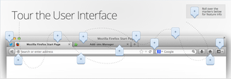
Take Firefox for example. In the latest iteration of their website home page they showcase eleven built-in features, then they mention becoming an expert in five easy steps and they also include at the bottom of the page a video about “Browsing Basics.” In comparison, the Chrome team simply introduces their browser without any embellishments whatsoever. I believe the Chrome teams internal motto is probably something like “focus 100% on what people do more than 80% of the time: surf the web as quickly and painlessly as possible!”

Firefox home page

Let’s back up briefly and consider the fact that some of the greatest technological innovations in the last ten years have come from simplification. Consider the mass distribution capabilities of eBooks today as compared to the mechanical printing press. Consider that an individual can now communicate instantly to millions using Facebook and Twitter as compared to creating and executing a mass emailing. How about the fact that you can use a search engine from your living room couch to search billions of pieces of information as compared to driving to the library and then spending an afternoon sifting thru microfiche.

So, in conclusion I want to encourage key stakeholders to consider that simplicity is very powerful. Every one of us can understand and appreciate simplicity with very little explanation. Simplicity sells itself. Simplicity makes our lives easier and we almost automatically feel gracious when a task can be completed with little fuss. This doesn’t mean that what something does in simple, it means that how we go about doing it is simple. And that is an important distinction.