6 reasons why your smartphone battery doesn’t last

I’ve surprised many people when I tell them my Android lasts less than 8 hours under heavy use. And, I’ve lost track of how many times I’ve asked someone how long their smartphone lasts and they really don’t know. The most common response goes something like this “…not sure because I plug it in whenever I get a chance.” Some of my friends even carry separate rechargeable backup battery packs to augment their limited battery life. As soon as their battery gets down to around a quarter tank they plug in the mega backup.
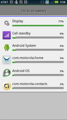
As a developer who builds apps for smartphones, I’ve spent quite a bit of time becoming very familiar with many of the configurable aspects of my various phones all the while using it intensively in build/debug cycles. And, I’ve put some thought into categorizing the different types of battery power usage of which some are less obvious than others. So here goes:

  1. Screen brightness. I turn it all the way down, but this does make reading the screen outside in bright daylight nearly impossible. The fact is the brighter the screen , the more pull on the battery.  On all my phones, the screen is the biggest gas hog.
  2. Number of applications loaded into memory.  Very few of us pay attention to how many applications are loaded/running versus completely shut down.  The more running apps the phone has to manage the more battery is drawn.
  3. Cellular signal strength. If your phone has a weak signal it will boost its own radio to try and compensate.  Cell phone signals are not constant and they ebb and flow all the time. On the down side when signals are weak, the phone will expend additional power to try and keep you connected. Sure, use wireless (wifi) were possible, but when wifi isn’t available you have to rely on good old cellular. It’s commonly understood that 4G draws the most power, 3G draw less and wifi draws the least.
  4. Duty-cycle for using apps. What I mean by this is how much time you use apps during the time period between charges.  If you spend 2 solid hours of app play time between 8 hour charge cycles then that means a duty cycle of 25% (2 divided by 8). The lower the duty cycle the less power is drawn assuming an idling phone with no apps installed is the baseline for minimal power usage.
  5. Number of applications that continuously connect to the internet.  This includes Twitter, facebook, FourSquare, email, etc. Secretly these apps can be very talkative in the background and you might not even know it. Every time they ask the mother ship for an update it draws power to make the request over the internet and then process the results.
  6. Talk-time. Everyone knows that talk time uses battery power, so this is obvious compared to items 1 – 5. On a smartphone you are usually doing other things in addition to talk time. In the days of feature phones, such as the original Motorola Razr, the only thing you could do with those was talk, talk, talk and intermix that with some limited texting. At least for me, over the period of 8 hours I’ve spent much more time (or duty cycle) using apps, such as email, as compared to making phone calls.

Hopefully this takes some of the mystery away from short battery life. We all wish batteries could last days, but we unconsciously create situations within our phones that draws down the battery much faster than expected. And, their are situations beyond our control. such as low cell signal strength, that draw extra power.

3 Steps for Determining if Your Website is Mobile Ready

Here are three step for helping determine the mobile ready strengths and weaknesses of your existing website. I’ve had a number of conversations from website teams recently asking the question: “Can we reuse our existing site for mobile users?” I was surprised to learn that the individuals asking me the question had, in fact, never visited their own site on a mobile device.

Note, this blog describes steps that need to be address before you decide whether to build for the web or native applications.

Step One – Create a small focus group of company outsiders, friends as well as employees.

  • Gather as many different types of mobile devices as possible including: iPad, iPhone, Android tablet, and several varieties of Android phones. Try to use a combination of older and newer devices. Don’t fool yourself by simply using all of the latest great versions, especially if your web visitors are the general public.
  • Get a mobile projector, such an Elmo or IPEVO.
  • Write down the common use cases, and the workflows associated with them. An example use case might be logging in to your site. And, a workflow would describe the steps a user takes to complete the login process  from beginning to the end.
  • Visit your website and run through the common use cases.
  • Turn off wireless, if possible, and let everyone experience typical internet speeds to simulate, for example, standing in line at the grocery store.
  • Trade off using different devices.
  • Hire a user interface (UX) designer if you don’t already have one. Bring them on board at the beginning, or as early as possible, in this evaluation process.

Step Two – Create a grading system to help assess the experience everyone had with each device.

  • Were you able to accomplish your task as easily and quickly as if you were at your desk with a full-size laptop or computer?
  • Did you have to do a lot of extra panning and zooming in and out to navigate through the use cases and workflows?
  • Was there any functionality that simply didn’t work, didn’t work correctly, or didn’t work as expected on the mobile device?
  • Were there any aspects of the site that looked different or wrong? For example, was all the text the right size? Was everything in the right place?
  • Were you satisfied with the amount of time it took for pages and images to load?
  • Were you able to comfortably use the site when rotating the phone between landscape and portrait views?
  • Were you okay with how quickly you were able to switch between different pages on the website?
  • Were you able to access secure resources without any problems?
  • And, perhaps most importantly, were there any obvious improvements you would like to see made to make mobile surfing experience better?

Step 3. Apply some commonly known mobile-specific conditions to your findings and see if helps to provide context to everyone’s experience.

  • One-handed plus gestures. It’s a fact that navigating a mobile web is significantly different from a desktop browser. There’s no mouse! Mobile browsing is usually done with one hand, while the other hand is used to hold the device. The screen is driven by what are called gestures. Examples of gestures are when you swipe your thumb upward on a page to scroll it downward, or when you use two fingers, usually the index finger and thumb, to pinch zoom the screen in or out.
  • Smaller Screens. And, of course the screens are much smaller than what you would find on a desktop or laptop. Different devices have different resolutions. And, navigating a full website can seem more cumbersome as you use gestures to navigate around, in comparison to the desktop experience of seeing the entire page, and using your a precision mouse to whip through the different links on a page.
  • Download Speeds. Download speeds on mobile devices vary considerably compared to your work machine hooked up to a reliable local area network (LAN). A site that seems zippy on your work machine, may load much differently on a typical smartphone. Also, for some older phones they may have much less processor power and that may lead to the perception of slower download speeds as the CPU chugs through displaying the page.

How do I interpret the results?

When you are done compile, discuss and analyze the findings with your internal teams and stakeholders.

Good. If most testers successfully navigated the majority of use cases and workflows then you are in good shape, and you may simply need to do some additional tweaking to your site.

Not so good. However, if most testers had unsatisfactory experiences then you’ll need to spend more time looking more closely as what worked and what didn’t work. You may find workflows that are great on a desktop machine that are clumsy and awkward on a mobile device.

Don’t be surprised. Portions of your site may have to be redesigned. You may not be able to include everything that’s in your full site into your mobile site. You may have to spend a lot of time optimizing the site to speed up page load times. Pay special attention to functionality that didn’t work on mobile. Mobile web browsers have well known limitations compared to full browsers. Looking at what didn’t work may help you decide if you need access to native device capabilities.

You’ve just taken a huge first step towards helping your team set the stage for stepping into the mobile world.

7 Critical Things to Know When Building Any Mobile App

This blog post builds on concepts proposed in an earlier post about not all mobile apps being created equally. If you are a developer who is in the process of migrating to mobile this post is for you. It’s intended to raise awareness of important items to consider in your requirements. My goal is to help you identify some of the major gotchas early on in the development process and improve your chances for success.

There are many more details to learn on the topics I’ve described below. The good news is that in the last few years the amount of deeply helpful documentation has expanded considerably. Where possible I’ve tried to include links related to each topic.

Touch-based Workflows. Recent research has shown that people use their smartphones more often than web apps, and they spend roughly 80% of their time on social media and games. Because of this and the fact that smartphones today are touch driven and not mouse driven, you have to take that into account in your user interface design. Touch implies many things including gestures and multi-touch. You can toss your old conceptions of user interface design based on desktops and tablets, and check out Android’s recommendations as well as Apple’s. My strong recommendation is to hire a UX designer to help you through building a user interface.

Mutliple form factors come with various screen sizes and densities. Long gone are the days of building for just three main browser types. Now you have to take into consideration iPhones, iPads, tablets, numerous different style androids as well as desktop and laptops. Android defines the following screen sizes and, as you can see, this is quite varied and smaller than a typical laptop or desktop. Those typically run 1024 x 768 or greater.

  • xlarge screens are at least 960dp x 720dp
  • large screens are at least 640dp x 480dp
  • normal screens are at least 470dp x 320dp
  • small screens are at least 426dp x 320dp

This is important to know because an app that looks good on an iPad may not look good, or display correctly, on the four inch display of a Motorola Atrix at 960 x 540. A button that looks correctly sized on one smartphone may look too big on another. A whopping 84% of all Android screens are what Android defines as normal size (>=  470dp x 320dp) and between either medium dpi (~160dpi) or high dpi (~240dpi). But, you still have to take into consideration other densities. I also recommend taking a look at new HTML5 browser-based technologies to help with addressing this problem, such as CSS media queries.

Inconsistent Internet. It’s a best practice to check if internet connections exist and gracefully handle HTTP requests when the internet is down, as I blogged about here.  Depending on your application and needs, you should also monitor whether or not a wireless connection can be made and then allow the application to switch to wireless where possible. Wireless also has the advantage of using less battery power.

Slower Connections. And, on a related note, you can’t always depend on 4G connections having consistent maximum download speeds. Over the course of a user session, the connection speed will vary widely and you should plan for that. I’ve been trying to find some stats on mobile internet quality world-wide, if they are out there they are hard to find. But, we’ve all experience spotty mobile internet coverage. Take this into account if you are transferring large amounts of data between your servers and your app. You should also consider detecting when the user is in an area of greater bandwidth and use that to download more data less often. Use loosely coupled and event driven architectures. Test app load times on various devices and around town and away from your office.

Less CPU Horsepower. While the latest generation of four core phones are certainly the most powerful phones yet. In general, applications and web pages will run slower on phones than they do on your development machine running a desktop browser. Take older generation phones into account because they are usually significantly slower than the newer phones. There are a few workarounds in HTML5 to help with this, in that done correctly they can offload rendering to the hardware. In native applications be aware of memory leaks because, remember, more memory usage means less battery life and applications that can run slower over time.

Support across multiple operating system versions. Remember on Android that the vast majority of users are still running v2.2 – v2.3.7 even though v4.x is currently shipping. You’ll have to do some research on your target market and find out what versions and type of phones they are using. You can’t support everything, but you can make educated guesses. Apple, on the other hand, has a significantly more limited selection of phones and tablets that you have to support, and they do a great job helping you support those.

There are some solutions that help with building cross-platform mobile apps, to go into more detail will take another blog post. Here’s a few: Adobe Flex, PhoneGap and Titanium. Keep in mind that the future of Flex, as a development platform, is being called into question after Adobe open sourced everything but the browser and desktop runtimes to the Apache Foundation. PhoneGap and Titanium offer what is now being called “hybrid” solutions where you can build an application in JavaScript, for example, and then compile that code for native deployments on Android and iOS.

Battery Life. Ah, battery life is last but certainly not least. Be aware of how battery intensive your application is and try to minimize battery consumption as much as possible. The Android online docs have a number of highly information articles on this subject. Smaller app footprint in memory means less battery consumption. Heavy CPU usage means more battery usage. Minimize GPS usage through smart algorithms to help preserve battery life.  Switch to 802.11 wireless connections where possible, since this requires less battery power than 3G and significantly less power than 4G.

So, there you go. I hope these suggestions help. If you have more suggestions based on your own experience please post a comment!

References:

Android Gestures

Android Optimize Battery Life

Android Screen Sizes and Densities

CSS media queries

Android UI Design

Android Model for Best GPS Performance

iOS User Experience

HTML5 Hardware Acceleration

Event-based Architectures for Adobe Flex