Simplicity is a beautiful thing. Making things simpler and easier to understand or use can be one of the hardest things to do. It’s human nature to overcomplicate things, to embellish, to add on. Some of the most beautiful things such as sunsets, beaches and mountains are singular in the powerful emotion they invoke yet infinitely complex. And so it is with software that it may do one thing really well but we have always have to add more features, more functionality and shift the primary focus onto them rather than on core goals. My problem is many software vendors often lose sight of user interface simplicity and simplicity is what really sells most things in the commercial retail marketplace.
Simplicity sells in spite of the fact that every single customer demands enhancements for their own unique requirements. Apple followed this simplicity model through a combination of hardware and software and for a time recently became the largest company in the world by share value. Google is an advertising company that for now is sticking mostly to its roots and that focus has helped drive their share price to over $1000 dollars recently. To quote the Pareto principle, also known as the 80-20 rule, I believe they’ve focused well on the 20% of things that many of us want 80% of the time.
On the other hand, I can barely use the websites for my bank, for my cell phone provider, and for my satellite TV. These are sites that I have to use every month to pay bills and monitor my accounts. I literally cringe whenever I get an email from them about new features being rolled out. Some of these sites barely work as it is, and many of them have navigation menus that resemble NASA’s command and control systems for a space launch. I always have to wonder how many more customers they would have it they took a simplification approach rather than endlessly adding features upon features rather than consolidating and redesigning.
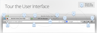
Take Firefox for example. In the latest iteration of their website home page they showcase eleven built-in features, then they mention becoming an expert in five easy steps and they also include at the bottom of the page a video about “Browsing Basics.” In comparison, the Chrome team simply introduces their browser without any embellishments whatsoever. I believe the Chrome teams internal motto is probably something like “focus 100% on what people do more than 80% of the time: surf the web as quickly and painlessly as possible!”
Let’s back up briefly and consider the fact that some of the greatest technological innovations in the last ten years have come from simplification. Consider the mass distribution capabilities of eBooks today as compared to the mechanical printing press. Consider that an individual can now communicate instantly to millions using Facebook and Twitter as compared to creating and executing a mass emailing. How about the fact that you can use a search engine from your living room couch to search billions of pieces of information as compared to driving to the library and then spending an afternoon sifting thru microfiche.
So, in conclusion I want to encourage key stakeholders to consider that simplicity is very powerful. Every one of us can understand and appreciate simplicity with very little explanation. Simplicity sells itself. Simplicity makes our lives easier and we almost automatically feel gracious when a task can be completed with little fuss. This doesn’t mean that what something does in simple, it means that how we go about doing it is simple. And that is an important distinction.

