In my job I not only give many technical presentations per year but I also get to watch many technical presentations. At some point, if you do enough presentations requiring live demos you come up with a battle plan to try and thwart technical glitches that can turn an awesome presentation into spoiled milk. Unfortunately not all of us have a dedicated army of technicians like Steve Jobs did, so we have to fend for ourselves.
Here are my top four survival notes to help you stay in the game.
Internet connection. Conference internet is almost universally bad. It shouldn’t surprise you that if you are presenting to a room full of geeks that almost everyone in the room will be consuming cellular and WiFi bandwidth to some extent.
If you present enough times, I can practically guarantee that you will experience intermittent connections or complete failure at some point. This can be very frustrating if your demos require an internet connection.
So, there are several ways to keep plowing ahead when this problem occurs:
- Take screen shots of any page in your application that requires a round-trip request to a webserver.
- While you are at home or the office and have a relatively stable internet connection, make a video your demos. You can play this back on your laptop without an internet connection and simply talk through your demo as if it were live.
- Pre-cache web pages before you go up on stage.
- Have a portable cellular hot spot with you. So if the conference WiFi goes down, you can switch to the hotspot. Check the hotspot bandwidth ahead of time! In really big conferences even the cell signal can degrade as thousands of people compete for bandwidth.
True story. I was at a conference of approximately 4000 people in San Francisco. In a workshop I was attending you had to download a very large file in order to properly set up the development environment. Instead of passing around thumb drives, most of the 75 people in the workshop tried to simultaneously download an executable that was approximately 750 MBs. It crashed the internet for the entire conference and most all of the technical presentations in the building came to a screeching halt.
Lesson learned: following these tips means you can keep presenting and be a hero even if the internet totally fails. The bonus is that the facebook/twitter/gamer addicted audience will have to pay attention to you because “they” won’t have any internet access.
Projector resolution. I use a Macbook Pro with a Retina display so I was totally hosed at a recent presentation because the projector forced my laptop into 800×600 presentation mode. Who uses 800×600 projectors anymore?? At a minimum I prepare for 1024×768 and I consider 1024×768 as the absolute bare minimum needed for technical demos. At 800×600 my screen real estate was so small I struggled to alternate between showing a web app in Chrome and demoing something in the developer tools. The Chrome user agent tools window, which is not resizable, took up more than half of the screen.
Lesson learned: when presenting at a new venue or a new room that you’ve never presenting in, always contact the conference coordinator ahead of time to verify the projector resolution .
Font size. It’s hard to see the code in most technical presentations. What looks normal to you on your 2880×1800 Retina Display looks like mitochondria under a microscope to the audience. If the audience can’t see your code you risk turning your great presentation instantly into a mediocre one that much less enjoyable to sit and watch.
And, as much as it drives presenters crazy, you will always have people sit in the farthest reaches of a room…and I mean way at the back. This can be especially true in very large conference rooms. To them your 12-point font settings in IntelliJ, XCode, Eclipse or Visual Studio make your code look like tiny, slightly blurry stars in the Milky Way Galaxy.
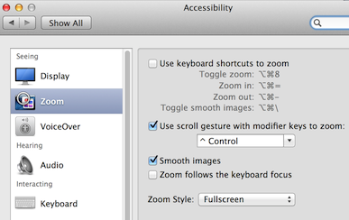
Lesson learned: There’s no such thing as making your font-size too large in a presentation. Seriously, crank up the font-size and then walk to the back of the presentation room and see if you can read it (without the aid of binoculars). Also make use of your operating systems built-in zoom capabilities. Zoom into the hard-to-see parts of your demo. Another trick is to simply cut-and-paste your code directly into your presentation template and then crank it up to 28 point or greater font size. Wrap your text if it runs off the edge of the slide. Black text color on a white background works the best.
Screen Saver. I’ve seen it happen many times where the presenter is standing in front of the screen talking to the audience and their screen saver kicks in. Then they continue to talk about stuff we can supposedly see while remaining unaware of what’s going on behind them. It’s even more embarrassing for the presenter if they have baby pandas or their family dogs as a screen saver image. Or, when trying to log back in they mess up their password a time or two.
Lesson learned: make sure your screen saver is disabled before you present. Thanks to @geeknixta, he told me about an awesome little app on Mac that takes care of this problem with one click…it’s called Caffeine.
