Adobe Flex Mobile Styles – Easily change the color of a Button

Have a mobile app using a default spark Button <s:Button /> and you simply want to change the background color? Wait just a second before you start creating a full-blown skin! It’s actually very simple – change the chromeColor. This info is buried way down near the bottom of the online reference doc. This also applies to ActionBar, ButtonBar, CheckBox, HSlider, and RadioButton.

Here’s one way to do it using CSS:

<fx:Style>
   @namespace s "library://ns.adobe.com/flex/spark";
   #shutdownButton
   {
      chromeColor: #FF0000;
   }
</fx:Style>

<s:Button id="shutdownButton" label="Shutdown?" click="shutdownButton_clickHandler(event)"/>	 

 Reference:
Basics of Mobile Skinning

Creating a Copy of a Default Spark Skin Class

Here’s five easy steps for creating a copy of a default Adobe Spark skin class in Flash Builder 4. There may be documentation on how to do this on the Adobe site, but I can never find it when the need arises. So, here goes:

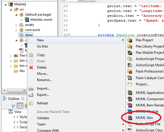
Step 1:  In Flash Builder, make sure you are in the Flash perspective (upper right hand corner), and right click on any folder in your project. Choose New > MXML Skins

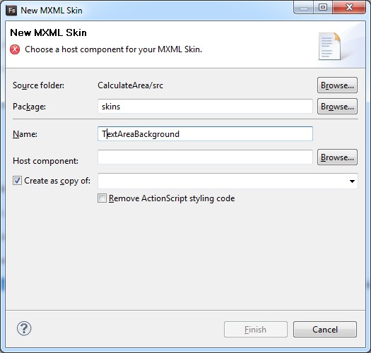
Step 2.  In the New MXML Skin window, fill in the package and name fields.

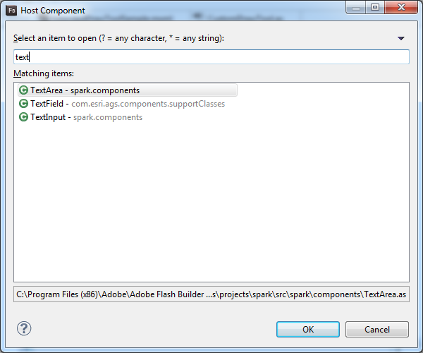
Step 3. Select “Browse” to choose your Host Component. Start typing the name of the component and choose the one that you need. Click Ok.

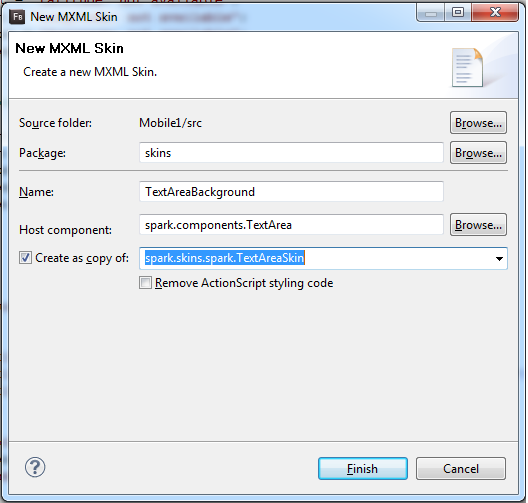
Step 4.  Check “Create as copy of”, and then use the drop down list to choose the skin you want. Click Finish.

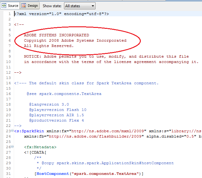
 Step 5. Make sure you see the Adobe copyright in the skin’s MXML file. And that’s it, you are good to go!