A little know setting in Chrome lets you easily spoof websites into thinking your desktop browser is an Android device or even an iPhone 4. This functionality has been around for about a year, but it seems very few web developers I’ve talked to actually know about it. It’s also not well documented in the Chrome developer docs, and it’s just mentioned in passing. So, this is me giving a shout-out to this very cool, useful and time saving functionality.
I love it because in seconds you can pseudo-emulate a mobile device view on the Chrome desktop browser. Sometimes I need to tweak something on a web mobile app and I don’t want to go through the hassle of viewing it on my device until I’m fully ready to test it on an external web server. With the user-agent tool you can set the size exactly for testing and viewing.
This is especially useful for when you are building responsive apps that use CSS3 media queries or frameworks like Twitter Bootstrap. In comparison, without this tool you have to manually resize the browser, which is time consuming, inaccurate and usually annoying.
Here’s how this works:
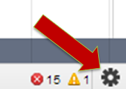
Step 1. In Chrome use Control + Shift + I to open the developer tools window. Then in the lower right hand corner click on the wheel icon.
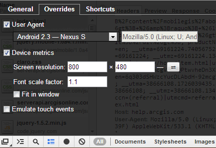
Step 2. In the Overrides tab you can select User Agent or manually adjust the device screen resolution and font scale. Cool! There is even a checkbox option to emulate touch events using your mouse. Note that there will still be mouse events, however you can also test code that listens for touch events.
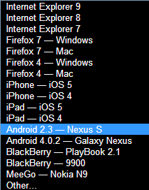
Step 3. Use the User Agent pulldown list to choose from various presets.
Step 4. Easily swap between landscape and portrait modes.
Step 5. Make sure the correct user agent was sent via HTTP request header in the Network tab of the developer tools. You may need to reload the page.
Step 6. Have fun and try it out yourself!


